Shaka444 Much better! Thank you!
There is also an issue with the menu overlapping the logo depending on width of the browser window.

With 7 menu entries, plus the Donate button and the Search field, the navigation region (the "nav" class) is way too crowded. One thing that would help is to remove the Home menu. But that alone will not be enough.
The Vitruvian website is pretty smart in how they designed their website navigation section so that it does no suffer the same problem:
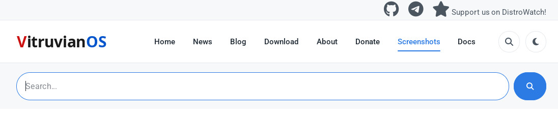
As seen from the above screenshot, they placed a strip above the navigation region with links. We could do the same and move there the Donate button and search field plus, why not, the Github and Telegram links (and maybe even a link to the forums?).
This would most likely free enough space in the navigation region to avoid the menu overlapping with the logo regardless of the browser (viewport) width, plus it would the additional benefit of making several important links more accessible (the strip could even be fixed at the top at all times).
One more thing I just discovered. In the Screenshots page...
https://renkuos.org/screenshots
...you are using the same screenshot for the Preferences and App Launcher boxes. I am sure you meant to use a different image for the Preferences, which is why I bring it up.
Anyway, food for thought! Oh, and my offer to help with the website still stands. 🙂